Every square meter is a challenge. Where space is at a minimum, maximum ideas are called for so that the guest toilet makes a brilliant impression.
Hosts in the past had it easy: their visitors first landed in the reception room and usually didn’t get any further than that. It was set up accordingly in order to make the right impression right from the start. Nowadays, homeowners have to resort to more sophisticated methods if they want to display style and personality in the most prominent place possible. What could be better suited for this than the guest toilet, the room that guests are most likely to see next to the living room?
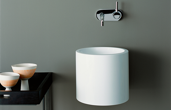
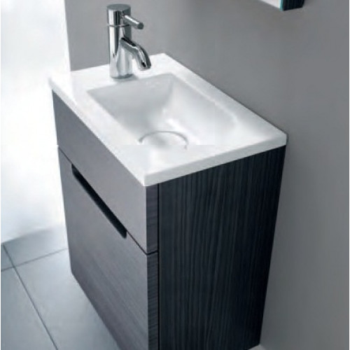
Functionality and aesthetics have to go hand in hand for a guest toilet to become the flagship of three square meters. The general rule is: as much freedom of movement as possible. That’s why the designers have developed clever solutions for the main bathroom’s little brother. The vanity is in the center. Whether rectangle, square or circle – the hand washbasins for the guest toilet are narrower and have a smaller diameter. Sometimes unconventional shapes are needed: mounted over the corner or pointing diagonally into the room, the all-rounders even outsmart the chimney and sanitary shaft in no time at all. If you opt for the smaller version, you need fittings that are tailored to it, for example with a shorter spout. This way no water splashes onto the wall and leaves no limescale stains.

The optics in no way suffer from the reduced format. It is usually puristic, clearly geometric shapes that score points in small guest toilets. They give the room structure and offer a great deal of creative freedom. The material can also make a statement: the classic ceramic is a down-to-earth all-rounder, while the more filigree steel enamel brings a designer feeling to the toilet and can also offer storage space by creating a cavity.
This is how the small room makes a big impression
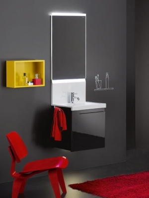
Where the floor plan leaves little space and there is no window, physics helps: little tricks with mirrors, volts and watts bring light into the bathroom and create additional square meters visually. The possibilities range from indirect lighting behind the wall mirror to targeted lighting elements on the wall or ceiling. Clever combinations of materials can create attractive contrasts.

The planner can also influence the proportions with the choice of colour. A colored end wall makes elongated rooms appear shorter. A dark floor in combination with light walls creates more space. High ceilings appear deeper with dark colors on the ceiling and floor. “Small bathrooms, small tiles”? The principle is passé. Anything is possible when colours, shapes and materials all work together harmoniously.

Clever combinations of materials can create attractive contrasts: slate and mosaic tiles, sandstone and glass, walnut and marble – there are no limits to creativity. If that’s too daring for you, you should opt for calmer tones and add splashes of color with the accessories. Here, too, it is the very personal accents, such as an antique mosaic as a shelf, that give the room charm and character. True to the motto: Small can be so individual!
To optimize your guest toilet, simply get in touch with our competent bathroom planners ! Together they select the best products for your individual flagship guest toilet!
Fürstenrieder Straße 38
80686 München
Neumarkter Straße 23
81673 München
Häberlstraße 20
80337 München